My summer taskS
Summer photos (tenerife)


I chose these select photos from my summer as they best demonstrate my photography skills in terms of how I take landscapes. for me taking photos of great landscapes are my favourite photos to take. this is because I like the idea of showing a beautiful place in such a way that makes the observer feel like they're there living the moment. It also demonstrates a high level of compositional skill as I made the decision of how much to include in the photo and how much to keep out of the shot, this meant that I did get to freely play around with the composition. My photos from Costa Adeje were solely focus on the landscape as I made sure to take these photos when there were literally no people whatsoever this was because I wanted to capture the true mood of the island without any human activity which also allowed me to focus a lot more on the contrast of the sunset and the actual landmarks.
Gallery viSiTs

Ingredients by igor kopystiansky (the Tate modern)
when I first looked at this photograph I instantly looked in the centre of the frame at the box this is because its the largest object. I also find it extremely intriguing due to the way the lighting has been used to create an effect as if the darkness inside is a small ibis. I think that the photographer has purposely set up a pitch black backdrop for where the photo is presented in order to further emphasise the idea of the darkness slowly engulfing the world. the photographer has clearly been very intelligent in the way that he has angled the box in the picture as we can still see that there is darkness inside however the objects inside (if there are any) are hidden and kept out of our sight. I believe that this could be to demonstrate the idea of us not knowing what is lurking in the darkness. I think that the photographer has chosen the select location of some random gritty dirty floor because he doesn’t want to keep the photo out of the ordinary. He wants us to at first glance see this as just a box on the floor of some random old street, but then when we think about it deeper and for a longer period of time we realise all the connotations that it has within that photo. For example the fact that the box is open and not closed could connote a sense of freedom. Whether it’s a physical freedom or a psychological freedom is down to everyone’s own interpretation of the photo.
when I first looked at this photograph I instantly looked in the centre of the frame at the box this is because its the largest object. I also find it extremely intriguing due to the way the lighting has been used to create an effect as if the darkness inside is a small ibis. I think that the photographer has purposely set up a pitch black backdrop for where the photo is presented in order to further emphasise the idea of the darkness slowly engulfing the world. the photographer has clearly been very intelligent in the way that he has angled the box in the picture as we can still see that there is darkness inside however the objects inside (if there are any) are hidden and kept out of our sight. I believe that this could be to demonstrate the idea of us not knowing what is lurking in the darkness. I think that the photographer has chosen the select location of some random gritty dirty floor because he doesn’t want to keep the photo out of the ordinary. He wants us to at first glance see this as just a box on the floor of some random old street, but then when we think about it deeper and for a longer period of time we realise all the connotations that it has within that photo. For example the fact that the box is open and not closed could connote a sense of freedom. Whether it’s a physical freedom or a psychological freedom is down to everyone’s own interpretation of the photo.
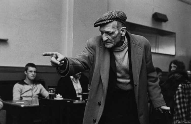
Tish murtha: works - the photographers gallery
When I first look at this photo for me it raises many questions about what the situation at hand is. It makes me think about why the old man is pointing and why the people In the background are where they are. I also believe that the photographer has disguised and hidden the eyes of the old man for great effect, as we can’t see the actual definition on his eyes. This makes the mood of the photo seem a lot darker and gives a much more serious tone to the piece. The photographer has chosen to have this as a black and white photo, and I believe that this is done in order to make the world around the man seem gloomy and colourless and to make sure that there is a sense of dullness in the surroundings. Strangely enough I think that the main focal point of this picture is actually the old mans finger. The reason I believe this is because that is where the questions lie as we want to know what he is pointing to, however, the photographer has left this out of the picture purposely to leave us confused and pondering what it could be as now it’s up to our own imaginations. One way in which this links to my future work is that I will be going on to using artificial studio lighting in order to create different lighting effects, and although this is in black and white we can see a range of tone created by different artificial lights.
When I first look at this photo for me it raises many questions about what the situation at hand is. It makes me think about why the old man is pointing and why the people In the background are where they are. I also believe that the photographer has disguised and hidden the eyes of the old man for great effect, as we can’t see the actual definition on his eyes. This makes the mood of the photo seem a lot darker and gives a much more serious tone to the piece. The photographer has chosen to have this as a black and white photo, and I believe that this is done in order to make the world around the man seem gloomy and colourless and to make sure that there is a sense of dullness in the surroundings. Strangely enough I think that the main focal point of this picture is actually the old mans finger. The reason I believe this is because that is where the questions lie as we want to know what he is pointing to, however, the photographer has left this out of the picture purposely to leave us confused and pondering what it could be as now it’s up to our own imaginations. One way in which this links to my future work is that I will be going on to using artificial studio lighting in order to create different lighting effects, and although this is in black and white we can see a range of tone created by different artificial lights.
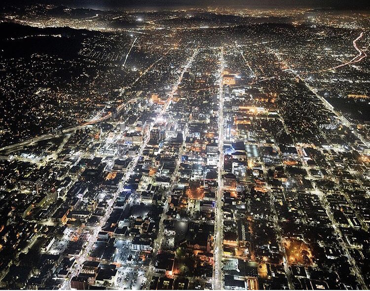
HIGH: Michael light - Atlas Gallery
when I first look at this photo I am amazed at how the photographer has managed to capture such a bright and lively landscape at angle that shows almost the whole city. My eyes instantly draw to the brightest lights in the centre of the page and my eyes follow through into the lines of the street where there are subsequently more bright flashing lights of many different colours. The writer has used a view that’s very high up but not entirely birds eye view. It’s my belief that this is done specifically to capture the whole city and everything in it in 3D motion as if u were actually in the city making for a superb masterpiece. This shot was clearly taken in colour and was evidently done on purpose in order to to capture the full mood of a typical night in California with the insanely bright flashing nights to show the liveliness to contrast with the darkness of night. I think that the California skyline was chosen for the location of this picture as it has a real beauty about it at night time as its one of those cities that never sleep. The shapes that are in the image have a descrete pattern of square and rectacular clustered together to make big rectangles. This is because u can see the lines that divides them as the roads which are lit up. The formal elements that have been applied are: tone, form, colour, shape and pattern. This links to my own work as I have also been contrasting bright lights with the dark in some of my Lee Bul recreation picture that are above.
Gallery quote:
"breath taking areal views of California"
1st contextual artist
examples of LEE Bul's work


Lee Bul is a South Korean artist who focuses very much on sculpting pieces out of many different various materials. She was born in 1964 and went to hongik university in Seoul and graduated from there in 1987. But spent most of her childhood fleeing persecution and living in temporary homes. Her work questions patriarchal authority and the marginalization of women and from this she creates abstract and cold mechanical looking sculptures.
One of the things that has heavily influenced her is sci-fi which is part of the reason her sculptures have quite a cyborg, alien looking theme. Lee Bul is also the winner of many prestigious awards the art world such as;
- Hugo Boss Prize (1998)
- The 48th Venice Biennale Art Exhibition (1999)
- The 13th Korea Seok ju Art Prize (2002)
- The 10th Korea Gwangju Biennale the Noon Award (2014)
- French Order of Arts (2016)
recreation in the style of Lee Bul


In our first lesson we were working on our first response to Lee Bul first we brought together many elements that would appear to be random but in fact were actually in order to make similar looking futuristic sculptures just like she did. I used many different materials to do so. some of the materials I used include: golden foil, soft plush material, jewellery, string, lights and mirrors. which helped us to create sculptures that loosely resembled her work. I also had a look at the composition when I was taking these photos in terms of looking out how close up to get on my photos, what to expose and what to hide. i tried to make sure in my framing that i included as little of the background as possible and I feel like this was achieved in the vast majority of the photographs, however a few of them (a small minority) included too much of the background for my liking, hence why in my three best photos no background is really shown at all other than in the last out of the three in which there is a plain red background.
My three best photos


The reason I have chosen these photos is because they all show different areas of skill in my photography. the centre photo shows me using shadow in order to create a sort of chiaroscuro effect. the 1st photo shows the experimentation with different artificial light to give a reflection using the mirror and onto the gold sheet. the last photo shows me paying attention to extremely small detail as I made sure to get all the small patterns and dents. I also played around with the colour of the lighting as I changed the colour to red. out of these three I do believe that the middle photo is the strongest one this is because I think it has a great balance of almost everything. its got a good balance of light and dark shows what I want it to show, and hides what I want it to hide. it also brings a lot of mystery to the observer as its near impossible to tell what the photograph is of as the photo is very close up, which means this can be considered as macro photography.
|
|
|


In these photos we were focusing on the formal elements of design, these are: Line, Shape, Form and tone, Pattern, Texture, Colour. we were focusing on incorporating these things in our focus and paying a lot of close attention to detail whilst doing so. We also focused on two different photography techniques which were macro photography (using the macro/close up setting) and also playing around with aperture in order to end up with photos that give us a certain depth of field and a specific point of focus.
Macro Photography - photography producing photographs of small items larger than life size. In order to achieve this camera technique successfully the close up camera setting is needed
aperture - a space through which light passes in an optical or photographic instrument, especially the variable opening by which light enters a camera.
The Lower the number, the wider the hole in the camera lens opens when taking the shot.
The Formal Elements of design:
Colour - the different colours that we see on a photo
Texture - the visual quality of the surface of an object
Shape - the lines that form together to create shape
Line - add emotional content to images. By leading the viewer's eye, they keep the viewer's attention focused on the image.
Tone - the brightness of a patch of a photograph which contrasts with dark patches.
Pattern - the different lines that make different shapes of an object
In this specific contact sheet the main focuses out of the formal elements of design were texture and pattern, this is because when using aperture we are creating a focal point by blurring out all of the unnecessary information from a photo. This means that when we look at the section that's in focus we are more inclined to notice the finer smaller details which include minuscule patterns that create the texture of a photo

the first artist i have chosen is Philip Igumnov. I have chosen him because i think he does many different interesting collages of various different things. he is a russian artist who is based in moscow. i think that he does many things that link to Lee Bul's work, such as; combining human form with other random objects. also he seems to have taken similar inspiration from sci-fi just like lee Bul has, however he does it in a much more explicit way whereas Lee Bul does it a bit more implicitly.

my third artist is Aisha Zeijpveld and i have chosen him because i like the way that he takes the human form way out of preportion by finding different ways to combine it with things such as walls and cutting out parts and distorting other body parts. this does link to Lee Bul's work because she too also demonstrates her use of the human form.
Kader attia - Artist analysis |

my second artist is Kader Attia and the reason i have chosen to look at him and his work is because even though he looks at a completely different topic of art (multicultural art) he still communicates his ideas in a similar looking way to Lee Bull with the futuristic looking sculptures. Attia was born in france in december 1970 (age 47) and is of algerian decent which is one of the reasons his work is linked to multicultural backgrounds.
|

key words: deconstruction, destroy, fracture, damage, disorientated, destructive, anarchy
Title: On n’emprisonne pas les idées (We do not imprison ideas)
the title of the work contributes to my understanding of the work by giving me things to link what i see to. for example the rocks smashing and bursting through the metal fence could relate to the idea of ideas braking through as no matter how hard people try ideas and thoughts are not things that can be contained or trapped, this means that everybody is entitled to an opinion no matter what and no one can take that away from them.
In the photograph it would appear as if rocks had been pelted at a rather frail, feeble and fragile fence and have completely torn and ripped through whilst at the same time wedging into the gaps themselves. I think the mood that this photo portrays is one of anarchy, chaos, and demolishion. I think this because my mind instantly is reminded of a war zone with everything all derelict and destroyed therefore I get connotations of cities in destress. I think the camera angle plays a huge part in the affectiveness of the photograph as the angle of the obliterated fence makes us seem like we a re gradually getting closer and closer and also this gives the effect as if the destruction is slowly but surely turning into reality.
If I was tasked with recreating this image I would need to take into consideration the arrangement of the rocks as I would need to arrange the rocks in a certain way that gives a fair amount of distance between each rock but not as similar as to lack spontinaety and randomness. The image has been composed in such a way that we get to see all angles of destroyed fence and yet has hid what would be on the other side of the fence. I believe that this is purposely done to add a sense of mystery as we are forever not knowing what's on the other side of the fence.
This links to the overall theme because its going looking at creating weird abstract sculptures which Lee Bul created (she was the first artist we looked at) and it also links to composition as we do see a clear element of composition in terms of the way we are only shown this mysterious smashed up fence and nothing else as if the photographer just wanted to show that with no context behind it leaving us a bit puzzled and confused at the same time.
I think that the context of this piece clearly influences it because it’s all about architectures affect on multicultural issues which Kader Attia clearly takes to the next level with this explosion of rocks at a fence. The context leads me to believe that he wants us to think about the deeper representation of the materials like the rocks being hard and destructive and able to break through such a weak surface of the metal fence representing that the ideas and opinions cannot be held back by such a weak force.
artificial lighting to enhance the formal elements of form and tone
Studio Lighting - we used studio lighting in order to create contrast of light and dark tones in the photos. This helps to give more dramatic lighting than artificial lighting. It is a good source of artificial light without having to use the camera flash this is because it can be angled in different ways to emphasise the shapes of objects whereas the flash can leave a person or object looking flat
side lighting photos (below)
Side lighting is using artificial light to put coming directly from beside the person/figure in order to create an affect where half of the object/person is immersed in shadow and the other half in the light. This allows half the face to be near silhoutted as evidence shown in the photos i took below. as we can see


Butterfly lighting (below)
Butterfly lighting is a portait lighting technique where the key light is placed directly above the models head in order to create a certain form of shadow (similar to the shape of a butterfly) on and directly below the nose. As we can see from the examples of my own photography the shadow is on the underpart of the phone however I managed to get two different anglesin order to show a different way of still incorporating the lighting technique.


Rembrandt lighting (below)
Rembrandt lighting is a portrait photography technique that is only successfully achieved when a small triangle shape light emerges out of the shadows that are on one half of the face and is shown just underneath the eye. as we can see here in the examples below it has been successfully achieved on two seperate models. We can see it much clearer when theres more of a contrast between the light and dark areas.


myra greene


Myra Greene is an African American Artist/photographer who was born in New York and grew up in Harlem. She was born in 1975. Her work is all about how people judge others on their physical characteristics such as skin colour, facial features and body type rather than actual personality and character. Her artwork and photography challenges and raises questions about these things by using extremely dark tones and incredibly harsh light tones in order to reveal, unflatter and expose certain facial features. She makes links to the ethnographic photography of the slave trade in the 19th century and reveals and uncovers the ugly history of the slave trade, hence why her photos are made to look like photos of slave livestock. Her work heavily links to her ethnicity as she comes from an African background so her ancestors had massive ties and links to slavery and may have possibly been inslaved themselves... "I was forced to ask myself, what do people see when they look at me. Am I nothing but black? Is that skin tone enough to describe my nature and expectation in life?"
Her work does play around with composition and she shows this by photographing just certain facial features on their own instead of her whole face. This is an extremely effective technique because it pays more attention to close up detail and gets in all the little hairs, wrinkles and spots which is what Myra Greene was trying to go for as she is specifically trying to show the reality in her pictures and uses all the little details to do so. She also plays around quite a lot with the lighting as the lighting is put in a certain way that vastly exaggerates the use of light and dark. This is in order to get very harsh light tones contrasting with very harsh dark tones. Although she usually makes sure that there are more dark areas than light ones, subsequently this makes the light stand out more and becomes the focal point to the observer as this is what we are drawn to at first sight.
Greene is a photographer that presents the premise of hiding more than what she shows in order to create a sense of mystery, not only does she do this by using composition and only photographing the facial features that she wants us to se. but she also does this by using the artificial lighting, this is because she uses the shadows to hide certain details and uses the light to expose others, this way we (as the observer) are left intrigued by all the little creases and lines in the human face that we don't usually get to see in photos that are from angles much further back. Which is why her actual positioning to take the photos is crucial to the effect she gives. From her work i can infer that the mood is dreary, depressing and unwelcoming. Not only can we tell this from the lighting and composition but also from the facial expressions. Her mouth is usually straight and stern
Her photography heavily links to my current work as I was using aperture to create a focal point. She is also creating the focal point but instead using composition, form, tone and lighting to do so. I’ve also experimented with using people’s facial features to get close ups and create work that’s in the style of Myra Greene, Within doing so I’ve made sure to adjust and play around with different angles and lighting methods, both in the studio and at home on family members. The fact that Myra Greene takes her photos so close up also links to another method we were doing in my photography, which is macro photography, although now is the first time that I have used it on human figures as beforehand my main focus was on objects (natural and man made). So to implement the techniques used on people and incorporate different forms of artificial lighting is a big step in terms of my development within the project.
home response to Myra greene |
Studio response to myra greene |


These are my two Myra Greene style photo shoots as you can see I've explored using different angles of different facial features to expose and unflatter the three different models that I have chosen. The photos on the right hand side were the studio response which meant that I gained access to the different studio lighting which gave me an advantage in creating contrast of tone as I could use brighter lights to create darker shadows. I feel that the quality of focus on these photos is higher than the quality of the home response ones due to the way I could use the light to my advantage. On the other hand I feel like my home response photos have a higher quality of framing and composition as I didn't have the studio lighting so I was more focused on my own positioning rather than the lights position, this meant that I got closer to the part that I was focusing on and left little to no space in the background without having to use any cropping.
Myra Greene edits


I feel that my most effective edit is the top right photo, this is because I feel that even though the black and white filters have been added it maintains a higher level of detail far above the others. A part of it that makes it an effective photo is the way how we can see the reflection of the light in the pupil whereas some of them come off a bit blurry or out of focus. These edits are similar to the works of Myra Greene in the way how they expose facial features ugliness, and add a sense of realism to the photo rather than making the model look appealing to the eye. This makes the photos seem like they have more of a deeper darker with a more depressing mood. Another thing that I really value and appreciate about the photograph is the framing and composition. As you can see i have used central framing to make the eye as the focal point of the photo and then the observers eyes follow the small details and wrinkles that are around the eye. Also I believe that the fact that I have filled the whole of the photo with the eye and the wrinkles around the eye and left no space for the rest of the skin makes the eye seem much larger than it really is so although its still being exposed.
Assessment photos


In this photo shoot I was adding my own creative twist on the work of Kader Attia. I used similar content to his “we do not imprison ideas” in the my response by using crumbled bucks and silver wire to create the same sort of emphasis on the destruction and dereliction. However I went for a more close up camera angle approach in order to get the variety of different textures visible in the photos, this also made me focus more on my framing and composition as I needed to decide how much of each brick I had to include in the photo and how much information I needed to hide in the photo. I also used studio lighting in order to give me a better contrast of light and dark tones in the photod I took, which subsequently also made the textures show in the areas that the light came from. This helped me to gain a wide range of different lighting in my photos by the use of artificial light. Whilst taking these photos I thought it was best to demonstrate all my different skills that I’ve learnt so far, these include: Aperture setting, macro photography, manual and auto focus, iso, shutter speed.
line and shape
Simon Phipps
examples of his work


My thoughts with this investigation are that it’s interesting trying to get the most aestheticly pleasing angles of close up architecture. I was exploring different ways of using line to draw the viewer to the created focal point. Hence why it was important to use horrizontal, vertical and diagonal lines in order to create this effect. The idea that I wish to implement on my work is creating distant focal points using the lines as I've shown this in a few of my photos however I haven't demonstrated this skill in too many. I feel that I made a few of these photos seem quite flat, which is a good effect in itself however, I would like to move away from this and use depth of field to create distant focal points.
my photo edits of my walk about photoshoot


In my opinion my most effective edited image is the top left, there are a few reasons for this. Firstly the composition of the photo is done in such a way that it breaks down the photo into three different sections that are split my two lines. Because of this the photo looks relatively flat however this is the intention of the photograph as I like that there is a flat contrast of light and dark directly next to each other. The fact that I'm using the contrasting tone to create lines that meet in the centre is linking to the main element of design that we are focusing on, which is line. the place where all three of these lines meets is the focal point as the observer follows the lines with their eyes until they get to that point where they meet. This makes the photo aesthetically pleasing as the lines are so straight and perfectly diagonally aligned to join together.
On the left hand side of the photo there are a variety of different textures presented with the way how the stairs are rough and dented is next to the rather smooth railing also provides a sense of contrast but this time provides a contrast of texture. The photo links to the work of Simon Phipps as it is a look on black and white architecture that demonstrates a rather sombre move, however this is much more close up than the style of Phipps' work. So although it doesn't completely replicate his style we can see small but direct links to his photography. In up and coming photoshoots I will be trying to focus more on the architectural buildings from further away angles in order to incorporate his style in more.
On the left hand side of the photo there are a variety of different textures presented with the way how the stairs are rough and dented is next to the rather smooth railing also provides a sense of contrast but this time provides a contrast of texture. The photo links to the work of Simon Phipps as it is a look on black and white architecture that demonstrates a rather sombre move, however this is much more close up than the style of Phipps' work. So although it doesn't completely replicate his style we can see small but direct links to his photography. In up and coming photoshoots I will be trying to focus more on the architectural buildings from further away angles in order to incorporate his style in more.


This was my second photo shoot response to line and shape, for this I went on a walk around Enfield town as the area is quite an urban area with many shops, houses, flats and offices which meant that I could get many different forms of line in different photos ranging from line and cracks on brick walls to lines on wooden fences and line in nature. In a few photos I can see more direct links to Simon Phipps as some photos incorporate extremely similar architecture to the ones that he uses in his photos, this made them so much more effective when it came down to the editing process as I mainly chose the photos of parts of buildings to edit as I felt it would be more fitting and suited to his style. I made sure to go and take these photos at around mid day so that i got the right amount of natural light in the sky without the sun coming out so i didn't get massive chunks of light that would obstruct my view of the line which is the main part I was focusing in the photo shoot.
my edited images


Key words: Composition, Line, Tone, Aesthetics, Angles, Architecture
My most effective paragraph is that of the one on the bottom left. The photo is of two buildings at an angle where one overlaps the other which gives the 3d affect to the photo even though the front building looks to be flat on its own as we can't see all three of the dimensions that it possesses in real life. The mood of this photo in my opinion is intended to be rather sombre and quiet this is because the darker tones of the photo are obtained by the taller building which makes it seem as if its a dark shadow towering and looming over everything. This makes the building have a fearful and powerful effect. The main thing that i appreciate about the photo is the composition, this is because i feel like i got the right balance of each building and i feel that I've captured everything I've needed to. Another thing that makes the photo so aesthetically pleasing is the angle that I've taken the photo at this is how I made the buildings look overlapped as without taking the shot from the diagonal angle of the architecture i don't quite get the same effect.
The process of making this photo was rather simple as first i had to find the right angle and get the shot using the camera and then i took to photoshop in order to help portray the mood i set out to depict. I did this by first using the black and white feature and adjusting which parts were the different shades and then added minor tweaks to the photo by using the dodge and burn tools which was how i made certain areas lighter and darker. Also i made sure to attach my zoom lens to my camera as I needed a relatively close up shot from the position I was standing in this was because I didn't want to include the whole buildings in the photograph as i felt that would give off too much information.
layered landscapes
layered landscapes is using different photos of landscapes and layering them on top of each other for different effects. This can be done in different ways. for example; photos of DIFFERENT landscapes can be layered on top of each other much like the work of Michael Wesley; another way of layering landscapes is by taking many photos of the same landscapes but at different angles so that the observer is looking at all angles of the building at once. I think that the idea behind layered landscapes is to cause a sense of confusion and also to look upon different cities and architecture in contrasting moods and perspectives. It changes up the dimensions of the photo by giving more to look at with less information given. This makes the observer ask more questions of the photo at hand, leaving more to the imagination to that of most photos. Layered landscapes can be used to fit many different themes such as culture, meaning, place, memory amongst many others. Its Quite a broad topic as theres no limit to the landscapes that can be brought together, these can include natural, man made, well maintained, derelict amongst many others.
Michael Wesley
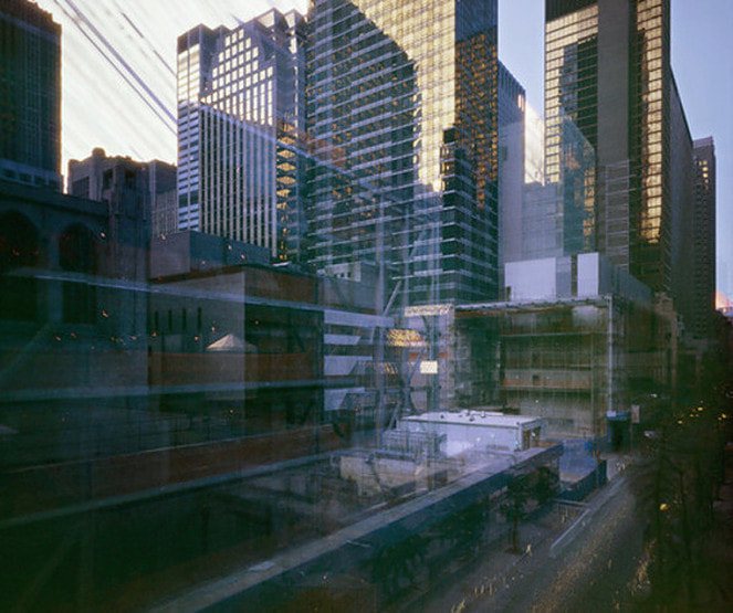
Michael Wesley is A German Artist/photographer who was born in Berlin in 1963. His work very much focuses on layering two to four different landscapes to create a sense of anarchy and chaos and confusion. They are layered in a way where we cant tell how and where each photo begins and how and where they end. it also makes it impossible to tell which photo is on top and which one is on the bottom as they fade into each other. Wesley's technique is one of a pioneers as it has never successfully been recreated to as high a standard as him. Wesley, himself believes that his exposures are durable enough for 40 years. To take his photographs Wesley uses a specially made pinhole camera which helps and allows him to capture the exposure of long cites, architecture and still life.
“The extreme length of exposure leads to a shift in perception. It’s no longer the motif alone that counts—that is often a more invisible than visible, merely looming presence. But peripheral conditions such as light, movement, and other atmospheric elements emerge differently as focal points.” - Michael Wesley (describing his own work
“The extreme length of exposure leads to a shift in perception. It’s no longer the motif alone that counts—that is often a more invisible than visible, merely looming presence. But peripheral conditions such as light, movement, and other atmospheric elements emerge differently as focal points.” - Michael Wesley (describing his own work
Idris Khan
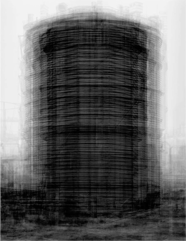
Idris Khan is a British artist who is based in London. Much of Khans work involves layering many different images on top of each other, (usually of architecture) so many times that the end product eventually looks shadowed and fading with contrasts of different shades of grey. Often he takes photographs of the same building in multiple different angles which also can make the architecture seem a bit distorted. He graduated the university of Derby in 2001 and went to the royal college of art to get his MA. He is a non practicing Muslim and a holder of a prestigious OBE award for his contributions towards the arts. Even with these achievements he remains humble by constantly working from his small home studio in Stoke Newington which he shares with his wife. Khan is mostly known for his photography, fine art, painting, drawing and sculpting.
"It is a challenge to not define my work as a photograph but using the medium of photography to create something that exists on the surface of the paper and not to be transported back to an isolated moment in time." - Idris Khan describing his work.
"It is a challenge to not define my work as a photograph but using the medium of photography to create something that exists on the surface of the paper and not to be transported back to an isolated moment in time." - Idris Khan describing his work.
Michael wesley analysis
Key Words: Layering, confusion, Landscape, Architecture, Chaos
Michael Wesley is a German artist who is most known for his still life layering and his layered landscapes. He uses around 2-3 different photos to lay on top of each other. When he layers landscapes these are usually skyline architectural photos of big flats and offices and occasionally we’ll known landmarks. The mood that he likes to express through his photography is quite a dark, gloomy, shadowy one. A lot of his photography looks ghostly with the way it fades it’s very faint, even the dark areas. and because it’s in black and white it gives off more of a quiet yet depressing mood. His still pictures manage to intelligently show the passage of time and his photos are concerned with temporality. He is a pioneer in his technique as he uses a pinhole camera to take his photots and takes them in such a way that cannot be replicated or recreated to as high a standard as him.
This photo is an example of the affect he can give by using his layering techniques. The main details that I really pay attention to is the white stripes in the sky, this is because to me it appears to be there most interesting as it looks as if chunks of the sky have just been taken out and thrown away. It’s the part of the photo that raises the most questions in my opinion as it looks as if it doesn’t fit in and it looks like it would be a mistake if it wasn’t intentional (which we know it wasn’t a mistake) so I think and ask myself why is that part of the photo nothing like the rest? What is it’s symbolic meaning behind it, if there is one. The only thing that’s ordinary about this photograph is the framing and composition as the whole building has been fit perfectly into the picture with no space either side of it and only a small part of the sky above it. I like the way how the vast majority of dark tones come from the bottom and fade upwards, this is extremely effective and is a massive contributor to the mood of the piece because it makes the building look as if it’s slowly being engulfed by the darkness. Also it could be a representation of the lower the social class the darker the personality of the person is and maybe Wesley is trying to challenge that, however, that’s just a possible interpretation. He has masked the second photo quite well as it is hard to see and mainly noticeable when close attention to detail is paid and encorporates mainly lighter tones in the second photo which means the further up in the picture you look the more it can be seen, which I feel is Wesley trying to make a point that the further up you are in society the more you are noticed and the lower down you go the less you are noticed. The fact that he has used buildings to demonstrate this is rather clever as building have levels and floors which create a system of order much like what our society has.
If I were tasked with recreating this exact image I would need a pinhole camera much like Wesley’s and I would need to get quite high up to take the photos needed, as we can see the high up views are taken from a relatively straight on angle so most the building (well at least the top) is in the photographers pereferal vision. The lighting techniques used are 100% solely natural lighting as the source of light is clearly coming from the sky, hence why theres much less light at the bottom because he’s literally set out to capture it the way it is without the need to add extra lighting.
This links to my own work as I too will be looking at different ways of layering landscapes and many different techniques of doing so. Being able to look at Wesley’s demonstrations could really help me moving forward in this project as it can show me how to put in different tones by simply just layering and without having to edit the contrast of shade. Another way that It links is because of the fact that he has been using long stretches of architecture which is an element of his that I would like to incorporate into my own responses when it comes down to it. His work can also help to teach me when it comes down to the framing and composition of building and how much space to leave with it when wanting to create certain effects.
My artist response


In this photoshoot I was looking to develop my ideas of layered landscapes by using the style of Michael Wesley. I specifically chose the location of Enfield chase and Enfield town as I new that I could get a variety of quiet naturalistic landscapes and rather busy urban looking areas that are full of life, the reason I did this was because I felt it would be good to have the contrast between the two different types of landscape. This also gave me variety when it came down to my editing (below). I made sure that I got to take my photos at around 4pm-4:30pm in order for me to get an orange looking colour in the sky as at this time of the year this is when the sun starts to set. I knew that I needed to take some of my photos at a level that is relatively high up in some of my photos so I managed to find a way to do this which was by taking the photos on the top of a double decker bus this ensured that I could get angles that made sure I was looking down on the part of the landscape I was focusing on.
The photos taken are similar to the works of Michael Wesley by using long stretches of architecture.
The photos taken are similar to the works of Michael Wesley by using long stretches of architecture.


Key words: exposure, fading, landscapes, confusion, chaos, anarchy
I think that the top middle photo is a demonstration of my best edit. I feel that it portrays a very intriguing mood, this is due to the fact that the content is a combinatination of a man made city landscape and a natural landscape. This gives a bit of variety in the photo and more different things to look at. It helps to give a lot of information in the photo whilst we can still question and challenge its content. The mood that it does give off is one anarchy and chaos as two worlds are mashing into one, its as if the whole reality as we know it has changed and deconstructed to coincide with another. The process of making the photo the way it is was by first using a dslr camera to take the photos of landscapes (which I had to bare in mind things such as composition for) and then I took to photoshop to layer the two landscapes on top of each other and fade different parts of the beneath picture on the top one so I have patches of each photo. The reason for giving patches of each is because I don’t want the observer to know where each photo starts and ends. I think this is my most successful photo because I have achieved what I set out to do in the edit which was to make the idea of physical, geographical landscapes more confusing for people to look at.
I think that the top middle photo is a demonstration of my best edit. I feel that it portrays a very intriguing mood, this is due to the fact that the content is a combinatination of a man made city landscape and a natural landscape. This gives a bit of variety in the photo and more different things to look at. It helps to give a lot of information in the photo whilst we can still question and challenge its content. The mood that it does give off is one anarchy and chaos as two worlds are mashing into one, its as if the whole reality as we know it has changed and deconstructed to coincide with another. The process of making the photo the way it is was by first using a dslr camera to take the photos of landscapes (which I had to bare in mind things such as composition for) and then I took to photoshop to layer the two landscapes on top of each other and fade different parts of the beneath picture on the top one so I have patches of each photo. The reason for giving patches of each is because I don’t want the observer to know where each photo starts and ends. I think this is my most successful photo because I have achieved what I set out to do in the edit which was to make the idea of physical, geographical landscapes more confusing for people to look at.


This second set of edits are again in the style of Michael Wesley, however, they have much more editing techniques involved in them. As well as using the gradient for fading the photos together and layering them I have incorporated the black and white style that can be seen on some of Wesley’s more noteworthy works. I also added an element of experimentation in some of these edited images. For example; I was using the orange filter on one of the black and white photos but I had to make sure that I didn’t overdo the amount of orange on the filter as I still wanted to get the photo looking rather smoky and cloudy, another way that helped me to do this was by using the dodge and burn tools that are on photoshop. These allowed me to change areas of tone to make them either lighter or darker and to give me areas that fade the tones and contrast them. My experimentation of combing a section of the coloured photo and the rest of the photo being black and white is probably my most effective edit. The reason I believe this is not only because it’s the hardest editing technique to master out of the ones I have done but also the way how the coloured segment of the photo is the orange sunset sky but also because it’s right in the centre of the picture it draws the observers eyes to that part first immediately creating a central focal point in the photo.
